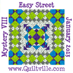
Here is what is on my design wall today.
I am making progress on my mystery quilt. I wonder why black and white quilts don’t look as good here as in person. This is much more vibrant in person.
Not sure if you can notice the curved block in the bottom corner. I am going to teach curved piecing at our retreat in March so this is one of my sample blocks.
Check out Judy L’s blog for more design walls.
Melinda


The colors in your mystery are great, and I love patterns that chain through the quilt! I also love your hexie blog header :c)
ReplyDeleteBonnie
This is looking great. I think colors change do to lighting when the pictures are taken and also everyone's monitor probably shows it a bit differently too. But, it is looking great.
ReplyDeleteThe windmills really zing.. looks like a great quilt. Also I love the hexagon heading on your blog
ReplyDeleteI love how the quilt is coming along. I've tried putting B/W quilts on pattern covers and it just doesn't work. They always come out flat but I know how gorgeous they are. I love curved piecing. It's not nearly as difficult at people think.
ReplyDeleteI love quilts with such a strong diagonal component.
ReplyDeleteWith orange you have vibrant. And, as usual, looks great.
ReplyDeleteWow - I think it is beautiful!!
ReplyDelete